The Creative Director’s Take on SKIMS: Tactile Branding, Quiet Chaos
SKIMS isn’t “just basics.” It’s a visual engine that treats Valentine’s Day like an art direction playground, not a discount holiday.
SKIMS isn’t “just basics.” It’s a visual engine that treats Valentine’s Day like an art direction playground, not a discount holiday.
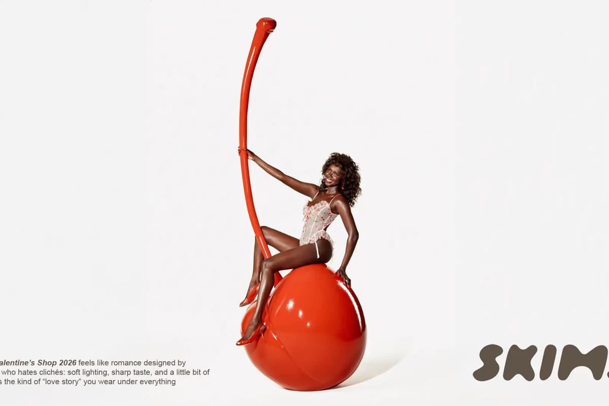
On paper, it’s shapewear, lounge, tees the kind of products that usually get marketed with the usual pink chaos and a caption begging you to “treat yourself.” SKIMS does the opposite. They turn Valentine’s into a series of controlled, save worthy scenes where the product barely has to talk, because the image already said everything.
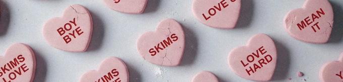
The first move is the smartest one: SKIMS doesn’t place its logo on top of a photo. They embed the brand name into the world like it’s an ingredient. “SKIMS” isn’t a corner stamp, it’s butter melting into a pancake, powdered sugar dusted like a signature, candy hearts pressed with phrases that feel like a group chat memo. That’s the shift: it reads less like an ad and more like a prop you could pick up. The branding becomes tactile, and tactile branding is memory.
Then comes the restraint (aka the part most Valentine’s campaigns ignore). SKIMS commits to one idea per frame with heavy negative space and clean, controlled lighting. Even when the concept is loud absurd pancake stacks, oversized candy, romance clichés flipped into pop-art, the camera language stays calm. Clean backgrounds, strong silhouettes, one dominant color accent. That “quiet chaos” is exactly why it feels premium: they let the concept flirt, but the execution stays disciplined.
The humor is also doing real work, but it’s delivered like a smirk, not a stand-up routine. Candy heart lines like “BOY BYE,” “HIS LOSS,” “YOU WISH,” “MEAN IT” sidestep the cliché romance script and land in modern internet tone: dry, petty light, self aware. The punchline isn’t hidden in a caption. It’s literally baked into the object. And because the typography and production are so clean, the joke reads as aesthetic instead of cringe, basically: they made the punchline feel expensive.
What keeps it from becoming random “cute seasonal content” is the world building consistency. The props are culturally legible (diner breakfast, retro romance, candy icons), the palettes stay controlled, and the compositions stay disciplined. Valentine’s is just the theme, the visual system stays the same. That’s the OS: you can swap the holiday, and the brand still reads instantly.
That’s the real takeaway for creative directors: SKIMS doesn’t market underwear. They market a scene you want to step into. The visuals entertain while they brand, so the viewer gets a moment worth saving, and the product gets to ride shotgun instead of yelling in the passenger seat. In Valentine’s terms: they don’t sell love. They sell a mood. Quietly. Repeatedly. Like a machine.


