Behind the scenes: How we rebuilt a plant-based nuggets brand (through design)
We just rebuilt Rebellyous Foods (plant-based “chicken”). And no, this isn’t a timelapse with cinematic music. This is the actual design logic, how you take a brand that’s recognizable but stuck and turn it into something modern, premium, and
We just rebuilt Rebellyous Foods (plant-based “chicken”). And no, this isn’t a timelapse with cinematic music. This is the actual design logic, how you take a brand that’s recognizable but stuck and turn it into something modern, premium, and freezer aisle ready without killing the humor (and without touching the logo).
Here’s the part most people don’t want to admit: the frozen aisle is not a website. Nobody “browses.” They scan like they’re defusing a bomb, fast, distracted, and emotionally unavailable. You don’t get time. You get two seconds before you become background texture. That’s why packaging isn’t “making it pretty.” Packaging is visual warfare with rules: be legible, be different, be remembered. Anything else is just expensive decoration.
Rebellyous wasn’t broken. It was just getting outgrown by its own look. The old vibe leaned playful/kid adjacent and a little nostalgic, which can feel friendly and also makes you blend into a category full of friendly. Worse: inconsistency across SKUs and claims quietly signals “small brand energy.” Shoppers don’t say that out loud. They just don’t grab you.
So we sharpened the blade.
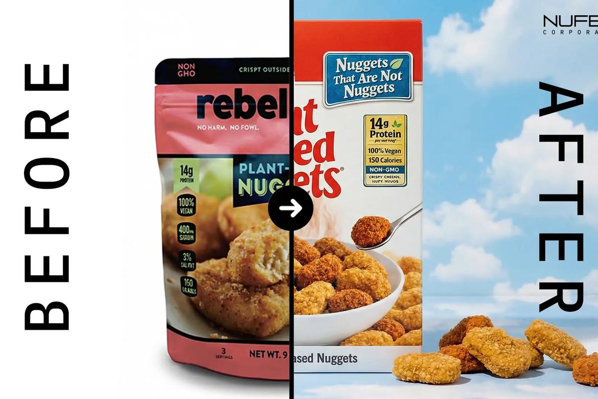
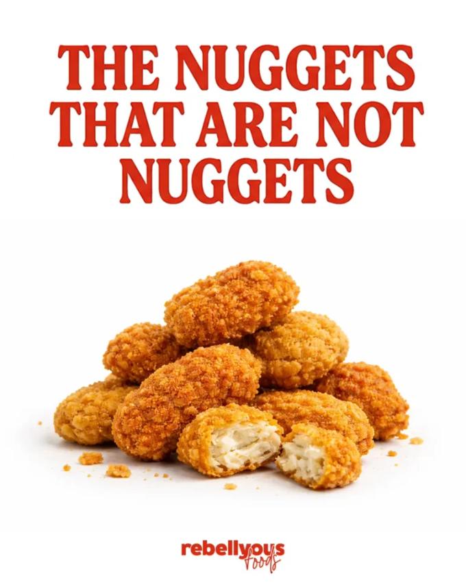
The whole rebuild ran on one contradiction: “Nuggets that are not nuggets.” Not as a cute tagline, more like a creative engine. It instantly says “tastes like the real thing,” creates curiosity (“wait, what?”), and gives the brand permission to be rebellious without trying too hard. And it plays perfectly with the existing DNA of “No harm. No fowl.” Same attitude, different job: one line sets the concept, the other reinforces the swagger.
Once that idea was locked, the question became: how do you make the contradiction visual in a way a human can understand in two seconds? We used one of the most recognizable food packaging languages on the planet: cereal boxes. Bold type. Punchy color. Big claims. Clean hierarchy. That specific “breakfast aisle confidence.” Then we dropped it into the nuggets aisle where it doesn’t belong. That mismatch creates cognitive friction, your brain goes “familiar” then “hold on, why does this look like cereal?” That micro second of confusion is the entire game. Confusion done right becomes attention. Attention becomes recall. Recall becomes repeat purchase. (Yes, your packaging is doing sales while you sleep. Finally.)
That’s disruption in packaging: not chaos, not noise, not trying to be “edgy.” Just one smart move that flips expectation while staying controlled. We weren’t trying to win by making the nuggets look 8% crispier than everyone else. We were trying to make the brand feel iconic, like an object with personality.
Then we designed for real humans, not brand decks. Rebellyous lives in two worlds: families (comfort food, school/foodservice context) and millennial/Gen Z flexitarians (snackable, easy, allergic to preachy wellness branding). The design had to work for both without splitting into two personalities. So we built a single vibe that can flex: fun + rebel + clean-modern. Bold enough to interrupt the scan. Clean enough to feel premium and trustworthy. Clarity with attitude.
From there it became a system problem. Packaging isn’t a poster, it’s a product interface. So we rebuilt the pouch around a repeatable architecture: a hero zone where name + product clarity hit immediately, a support zone for claims/icons that doesn’t clutter, a personality zone where the voice lives, and a proof zone for nutrition/details that stays clean and legit. This is how you scale nuggets → tenders → patties → future drops without your shelf looking like a garage sale.
Iteration is where “ownable” shows up. We explored multiple directions and refined the winner through rounds with real purpose. Each pass got bolder, clearer, and more distinct. Humor got sharper, less “cute,” more confident. Disruption got more visual, stronger contrast and more intentional composition. And the system tightened, claims, icons, SKU logic, spacing, everything behaving like a language, not a collage. Good packaging isn’t one trick. It’s dozens of disciplined choices that make the final result feel inevitable.
We also treated voice like a design feature. The “warning” copy and playful nutrition moments weren’t throwaway jokes, they were built to be screenshot bait. The pack feels like it’s talking to you, not selling at you. Personality creates recall. Recall creates repeat purchase. (And yes, this is why some brands feel sticky even when their ads are mid.)
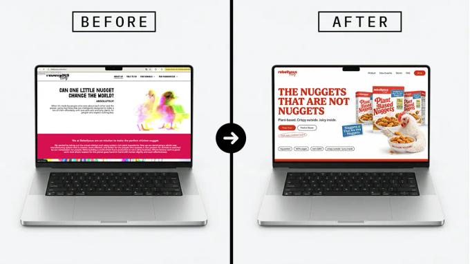
Finally, product visuals: crave first, not fake perfect. Natural variation so it feels real. Motion instead of flat staging. Clean backgrounds so it performs in ads and storefronts. Because a rebrand shouldn’t read as “new bag.” It should read as a new era across packaging, ads, social, and web direction.
The result: a freezer aisle ready brand system that feels modern, premium, bold, and unmistakably Rebellyous. More importantly, it’s ownable. It takes a familiar visual code, moves it into the wrong aisle on purpose, and turns that contradiction into the signature.
That’s disruption as design: using expectation as material, then breaking it with intention.
Because packaging is art with a job. The best work doesn’t just look good, it makes people stop, look twice, and remember what they saw.


